Monday, 9 May 2011

what ways does your media product use, develop or challenge forms and conventions of real media products?

Contents Page

The function of a contents page is to allow the reader to find the information they need by using page numbers so they can flick to the page they want easily. I made my numbers bold as they could stand out on the page for the reader to see, this followed the convections of a real contents page.
       The main image on my contents page was another picture in the gardens still representing the country girl Eliza once was. The colour scheme is still continuing as you can see on my contents page, this is so my magazine can flow. I took the idea of using a band finder from a magazine called 'NME.' I decided to put a bandfinder in my contents page as I thought it would give the reader an insight to who will be appearing in my magazine, this is also relating to my taregt audience as the kind of artists mentioned in the bandfinder would be the ones they would listen to. 

In what ways does your media product use, develop or challenge forms and conventions of real media products?

This is my final double page spread. My double page spread is focused on the main artist featured on the cover of my magazine, with a story focused on the artist. I feel my magazine conforms to a real magazine as this is evident with the idea's I used to create my double page below.
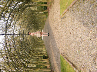
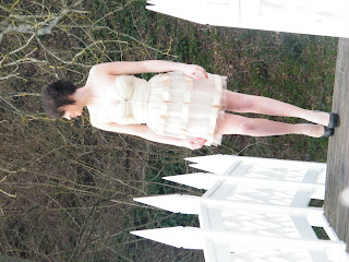
       The basic outline of the story that I was trying to achieve was that she was once a country girl but then reached her teenage years and turned into the typical teenager with attitude and all she wanted to do was sing and go out, Eliza then went through life changing experiences which made her go back to her country ways,I wanted this to show in my double page spread. I took the photos in my garden as I wanted the background to represent her upbringing. I purposely used the white bridge as I wanted the colour of the bridge to highlight her purity. I also used the grass and trees in the background of the photo as this also represented her upbringing. I also wanted the clothing in the picture to do this to, this is why I asked my model to wear this particular dress as I think it made her look innocent and young, which is reflecting her younger years. I decided to put a picture of Eliza when she was in the band as the stance of her pose shouts out attitude.
       The Heading 'The Comeback Kid' was Bold and followed my colour scheme and this made it stand out on the page , and I thought it would give an insight of what you would be expecting to read in the artical. The question and answer format is easy to follow, and I also asked certain qeustions that would make Eliza open up about her life which would make the reader feel apart of the interview. The pull quotes also followed the colour scheme and I also thought by matching the colours with the title they also would stand out from the page.

Existing Double Page spread Ideas...


Sunday, 8 May 2011

How does your media product represent particular social groups?

In each of my images I have chosen yound models which attract the target audience audience as the magazine is clearly current and trendy.By using a mix of genders in my images shows that my magazine can appeal to noth genders. From the main image it shows that Eliza is a mainstream female soloartist, which would appeal to a wider audience.


What kind of media institution might distribute your media product and why?

The distributor of a magazine is responsible for maximising magazine sales in the most cost-effective way. If my Media product was to be distributed I would choose Frontline Ltd to do so. In order for this to be done it would have to go through the chain below...

PUBLISHER------>  DISTRIBUTOR------>WHOLESALER  ------->RETAILER------->CONSUMER

Frontline is owned by Bauer. Bauer owns Frontline Ltd, which is the biggest magazine distributer in the country . Frontline distributes over 55,00 magazines to different shops. The fact that so many publishers trust frontline Ltd shows that my magazine will be successful.


Who would the audience for your media product?


Women-99%
Still studying-69%
work fulltime-31%
Married and living with partner-23%


Big Spenders

£45 on i-tunes a month
£15 on CD's a month
92% own a ipod


Gigs and events...

96% love gigs and attend regulary
Attend at least 2 festivals a year
56% are tempted to buy things they have seen advertised
Music Fan Profile

Pop music..


Age : 18-30

What would they wear?...

Women: they would mainly where dazzling things like sequin dresses with diamond rings. Not 'chavy' but classy. The heels make the outfit they have to be eye catching and as high as possible.

Classy To Trashy...

They start there night off looking glamorous. Backcombed hair, Extravagant makeup done up to the nines.Strutting there stuff with figure hugging clothing. They get to the club and start on the jagerbombs, wkd's etc. Boys looking at them left right and centre, offering to buy drinks for them trying to get them drunk as they no they are to good for them so by getting them drunk they put their 'drunk googles' on and they may then be in with a chance with them, they except and end up 'legless'. They then start to eye up the typical 'chocolate boy' wearing timberland boots, jeans, and a Lyle and Scott knitwear jumper, which is usually two sizes too small to show off ' their guns.

What would they listen to?

They would listen to dance, pop things that just got them dancing like Lady Gaga, Justin Bieber, Akon, Cheryl Cole etc.


Would Usually wake up with a serious hangover, Make up down there face, hair a complete mess just generally feeling Minging. Something like this....


Mission Statment..

Bassline

FE productions new project Bassline is a new kind of pop magazine. Bassline is set at the 18-30 mindset.
Bassline readers have passion for music and know exactly what and where they want to go in life.
Bassline contains all the elements that able's the reader to keep upto date with the latest songs and goss.


How did you attract/adress the audience?

The way your magazine is protrayed to the audience is important as it has to intrest them so it can be successful.

Images...
The pictures play an important role as they are the main attraction to the first viewing of the magazine. Images are so important as they are the foundation of what the magazine will contain. The outfit I chose for the Artist to wear on the main image involved her wearing white jeans, sparkly top and blazer. I found that this attracted both genders because the men would look at the magazine and find her 'appealing to the eye' it would attract women as they could look up to her. I asked the artist to stare into the camera as this created 'The gaze'.

Layout and colour...
The colour scheme of black yellow and red adress the audience as they arnt particularly femanine colours but are ones that would intrest both genders. This would mean that the colour scheme hasn't got a specific gender association which opens out my target audience to both genders.

Content...
I made the main story from a realife subject, I found that by making it more realistic it would attract more people as its something they may be going through. So instead of hearing all the things they could have because they have so much money, I concentrated on subject that the members of the public could associate there life with.

What have you learnt about technologies from the process of constructing this product?


When producing my magazine I used a variety of different technologies. These are all explined below...
I used a camera to take my pictures. Before taking my pictures I had to plan what kind of photo I was thinking of taking, for example would I be using a close up? Would I be keeping the background or editing it out? I tried to make my pictures reflect the artists identity, this was evident on my double page spread where I used the outdoors to review my artists love for nature.
Paint Shop Pro is a programme that is used to edit images. I used it to remove the background of my front cover image, I also used it to feather an image.
 Adobe InDesign is a software application produced by Adobe Systems. It can be used to create works such as posters, flyers, brochures, magazines and books. This alowed me to design and function a layout for my magazine.
As apart of the construction of my final product I used the internet to undergo research of exsisting magazines, this helped me acquire an understanding of the codes and conventions of music magazines.
Adobe bridge allowed me to bridge the photos from the camera to Adobe Indesign

Tuesday, 3 May 2011

Looking back to your preliminary task what do you feel you have learnt in the progression from it to the full production?

          
The preliminary task of the production was to create a school magazine front cover. This allowed me to get to grips with the technology I was going to be using for my final production.
  • You can see a clear improvement in the layout and design when comparing my final production with my preliminary task.
  • I'm not completely happy with my front cover as I think it was my weakest point in the production of all three pages. The main problem I had was fitting everything in without it looking cluttered but then not looking to boring.
  • I've learnt that the main image plays a huge role in where everything else is placed.
  • For the preliminary task you can see the pictures look out of place, it just looks to plain. This was a hige advantage to me as i could leanr not so much from my mistakes because i dont feel that i made mistakes more lack of understanding when it came to using the technology, and used this to plan my final product.
  • I am happy with my overall production as i feel that by following the codes and convections of magazines mine looks like it could be seen on a shelf with a few adaptions.


Tuesday, 15 February 2011

Rough plan of what i want my Double page spread to look like...


I like the layout of this double page spread because I think its conventional.

The idea of Eliza holding a flower is symbolising ' the real her' and the background to which she grew up in ( sorrounded by nature.)

The idea of having a subsidary image is that its showing what Eliza looked like when she was a member of the band 'Sisterhood.'
Its basically highlighting how much she has changed not only her attitude but looks too.